IN THIS ARTICLE
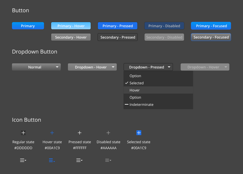
O3DE UI Button Styles
Use buttons to enable users to make selections that cause the UI to take action. There are four types of button styles in O3DE:
- Primary button
- Secondary button
- Dropdown button
- Icon button
Usage guidelines
Follow these guidelines as you design your UI with buttons:
Buttons should trigger events
Choosing a button should always trigger an event. For example, the event might be submitting a form, opening a dialog, or showing a dropdown menu.
Primary button vs secondary button
Only one primary button per page should receive the primary button color. We recommend that you always set the affirmative button with the primary button color. All other actions on the page should be styled with the secondary button color, which will help users establish what the primary action on any given window or panel is.
Button placement in a dialog
The buttons should be placed on the bottom right hand corner of the dialog, with the affirmative button on the left, and the dismissive button on the right on the Windows platform. This reduces cognitive load for users and clarifies the hierarchy of available actions on the page.
When on the iOS platform, the button placement should follow the iOS platform guideline, which is the affirmative button on the right, and the dismissive button on the left.
Button placement on a card
Because cards have flexible layouts, we recommend that you place the button in a location suited to the content and context, while maintaining consistency within the product. When the button isn’t attached to any labels, it’s suggested to place the button in the center of the area.
Dropdown menus
Use dropdown menus where there is more than one value associated with the button. When users choose the button and select the desired value, buttons should immediately trigger an event.
Icon buttons
Use icon buttons when there isn’t enough space to display the full text on the button. However, the context should be clear to users what action will be triggered after clicking on the icon button. The icon shown on the button should also clearly represent the meaning of the function. Use a mouseover tooltip to display the text version of the button.
Avoid these design choices when using buttons:
- Don’t include a button as part of a sentence.
- Don’t include more than one primary colored button on a UI.
- Don’t use an icon button when there isn’t enough context for users to know the purpose of the button.
- Never hide a button if a button is disabled. A button should always be visible to the user, no matter its state.
Applying styles
You can apply one of the four button styles either in the Qt Designer, where it is saved in the .ui file, or in your code. Refer to the comments in the example below for details.
Example
#include <AzQtComponents/Components/Widgets/PushButton.h>
#include <QPushButton>
#include <QToolButton>
#include <QMenu>

// Secondary button is the default style for QPushButton.
QPushButton* pushButtonSecondary = new QPushButton(parent);

// To define a QPushButton as a primary button,
// set "default" property to true in the .ui, or apply the primary style.
QPushButton* pushButtonPrimary = new QPushButton(parent);
AzQtComponents::PushButton::applyPrimaryStyle(ui->dropdown);

// Apply the icon style to a QToolButton by adding an icon.
QIcon icon(":/stylesheet/img/logging/add-filter.svg");
QToolButton* toolButton = new QToolButton(parent);
toolButton->setIcon(icon);

// You can also apply the small icon style to an icon button.
AzQtComponents::PushButton::applySmallIconStyle(toolButton);

// Add the dropdown style to a push button or tool button using setMenu().
QMenu* menu = new QMenu(parent);
auto menuOption = menu->addAction("Option");
menuOption->setCheckable(true);
pushButtonSecondary->setMenu(menu);
toolButton->setMenu(menu);
C++ API reference
For details on the button styles, see the following topic in the O3DE UI Extensions C++ API Reference:
Relevant Qt documentation includes the following topics: