IN THIS ARTICLE
O3DE UI Card Widget
Use cards to display information in highly interactive, flexible containers. Users can easily stack, reorder, and collapse these containers. All content within a card should relate to only one idea. Cards should be easy to scan for relevant and actionable information, and are predominantly used to display editable details for a component or a class.
For example, a card might include common properties, action buttons, advanced settings, and a context menu for additional actions:

To make it easier for users to scan a card, make the content layout consistent. This includes using the same font size, style, and spacing for headings and content. Be consistent with your use of images and icons, and primary and secondary actions (if required). Card titles are key to allowing users to easily scan the content, so make sure the titles are highly visible.
Anatomy of the card widget
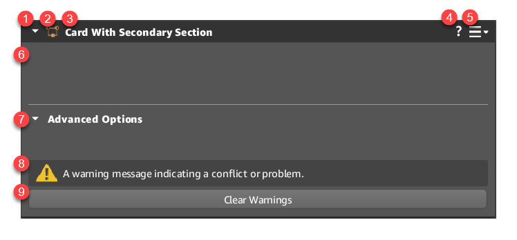
Cards allow for a certain amount of customization. The basic layout of a card includes the following features:

Expander and header bar
Cards expand or collapse when users click the arrow on the top left.
If the card can be moved, users press and drag the header bar to reposition the card.
Card icon
(Optional) Cards can have their own unique icon related to their purpose. For the full list of icons, see O3DE component icons.
Note:Two icons are required for new components:
- A 16 x 16 SVG with a background box for the perspective window.
- An SVG for everywhere else in the editor, without a background box.
Card name
Each card has their own name related to their purpose. You can configure the name to change from white to orange to signify that content in the widget has been modified.
Help icon
(Optional) Cards can display a link to documentation that describes the card’s functionality.
Context menu icon
(Optional) The card’s context menu opens when users choose this icon. The context menu can also be opened by right-clicking the card header with a mouse.
Card content widget
This area contains the content widget for the card. Most cards contain a reflected property editor component, but cards can hold any widget.
Advanced options
(Optional) When a secondary content widget is set, a label for it is displayed here. The Advanced options menu expands or collapses when users choose the arrow on the left of the label. You can customize the label’s text.
Notifications
(Optional) Notifications that you added to the card are displayed here. Buttons or other widgets can be added to notifications as a means of resolving them.
Call to action region
(Optional) Supplemental actions should be placed at the bottom of the card. We refer to this as the Call to Action region. Typically, a call to action is represented by a button added to the bottom of a content widget, or in a card notification. Avoid using primary buttons here because they should be reserved for the overall action on a page. Instead, use secondary or tertiary buttons, link buttons, and icon buttons here.
Basic card

The simplest card consists of these components:
- Card header
- Expand/collapse icon
- (Optional) Card icon
- Card name
- (Optional) Context menu (enabled by default)
- Card content
Example
#include <AzQtComponents/Components/Widgets/Card.h>
#include <AzQtComponents/Components/Widgets/CardHeader.h>

// Create the card.
AzQtComponents::Card* card = new AzQtComponents::Card(parent);

// Set the card icon.
card->header()->setIcon(QIcon(QStringLiteral(":/stylesheet/img/some_icon.svg")));

// Set the card title.
card->setTitle("Example Card");

// Disable the context menu (enabled by default).
card->header()->setHasContextMenu(false);

// Add the content widget.
card->setContentWidget(new QWidget());

// Add the card to a UI layout as needed.
Card with context menu and help icon

Display a help icon on the card to redirect users to a webpage for documentation.
The following code demonstrates how to set up a help link and start a context menu.
Example
// Set the card help icon.
card->header()->setHelpURL("https://o3de.org/docs/");

// Enable the context menu (enabled by default).
card->header()->setHasContextMenu(true);

// Some base code to add a context menu.
// contextMenuRequested is triggered both by clicking the context menu icon
// and by right clicking the Card header.
connect(ui->basicCard, &AzQtComponents::Card::contextMenuRequested, this, [](const QPoint& point) {
    QMenu basicMenu;
    basicMenu.addAction(new QAction("Some Action", nullptr));
    basicMenu.exec(point);
});
// Note: The menu can be created in advance and executed on contextMenuRequested.
Card with secondary content

Display a secondary content widget. Its title is customizable.
Example
// Set the secondary content title.
card->setSecondaryTitle("Advanced Options");

// Add the secondary content widget.
card->setSecondaryContentWidget(new QWidget());
Card with modified content

Configure the care title to change color when the content is edited, different from the parent slice, or has not been saved yet. We recommend enabling this functionality on all cards.
Example
// Set the content modified state in response to content change.
card->header()->setContentModified(true);
Disabled card

Fully disable the card, including header bar icons and child widgets.
Note:If you want the card content to be disabled, but allow users to still use the help button and context menu in the header bar, use the Mock Disabled state.
Example
// Disable the card widget using a Qt function. All functionality of the card is disabled.
card->setEnabled(false);
Mock disabled card

Disable primary and secondary widgets on the card, but keep the header bar enabled. The following card features remain functional:
- Expand/collapse
- Help
- Context menu
Example
// Display the card as disabled while retaining functionality in the header bar.
card->mockDisabledState(true);
Card with warning state

Set a warning state on the card header.
Note:You can independently set the disabled state and warning state.
Example
// Display a warning icon in the header bar to indicate a warning state.
card->header()->setWarning(true);
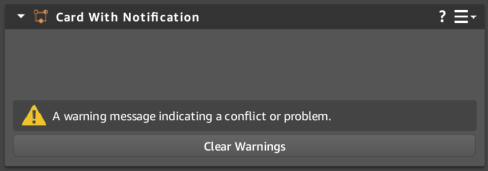
Card with notification

Add notifications to indicate misconfigurations and other errors. Remove the notification when the issue is resolved.
Customize the notification with the following:
- Message
- (Optional) Action button
- (Optional) Custom widget
Note:In addition to buttons, you can useaddFeature(QWidget*)to add a custom widget to the warning notification.
Example
#include <AzQtComponents/Components/Widgets/CardNotification.h>

// Create a new notification with a message string.
AzQtComponents::CardNotification* notification =
    card->addNotification("A warning message indicating a conflict or problem.");

// (Optional) Add a custom button to the notification.
QPushButton* button = notification->addButtonFeature("Clear Warnings");

// Connect a behavior to the button.
connect(button, &QPushButton::clicked, ui->functionalCard, &AzQtComponents::Card::clearNotifications);
C++ API reference
For details on the card API, see the following topics in the O3DE UI Extensions C++ API Reference:
Related links
For additional information related to the card component, see the following topics:
