IN THIS ARTICLE
O3DE UI Combobox Component
Use comboboxes to offer users a list of options from a dropdown menu. You define whether or not the input box is editable. An editable input box allows the user to type in a value or select a value from the dropdown menu.

Usage guidelines
Follow these guidelines as you design your UI with comboboxes:
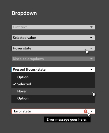
When a user mouses over the combobox, a border line should show around the combobox.
Use a dropdown list to give the user an option to make a single choice from a set of mutually exclusive options.
Use a dropdown list when the number of options is greater than 2 and less than “a lot”. When you have only one or two options, use a radio button group instead. It’s difficult to prescribe an upper limit on the number of options, because it depends on context. However, it is acceptable to have a long list of choices when users are likely to be familiar with them and the options are well-ordered and easily scannable to the eye.
Set a default value that most users would likely select. If you choose not to use a default value, include strong and clear placeholder text instead, such as “select size”.
Sort the values to best match the mental model of your users. Use your best judgment on how a user will expect options to be ordered, such as sequential dates or car models. Often, using an alphabetical or numerical order is appropriate, or you might consider grouping options by theme.
Avoid these design choices when using comboboxes:
- Don’t use a dropdown list when users might want to select multiple options. In that case, use a set of checkboxes, or buttons instead.
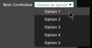
Basic combobox

Set up and control comboboxes in Qt Designer or in code.
Example
#include <QComboBox>

// Create the combobox.
QComboBox* comboBox = new QComboBox(parent);

// Add choices to the dropdown menu and set the default value.
for (int i = 1; i <= 5; i++)
{
    comboBox->addItem(QString("Option %1").arg(i), i - 1);
}
comboBox->setCurrentIndex(0);

// (Optional) Use placeholder text if you choose not to set a default value.
// When setting placeholder text, the combobox must be editable.
comboBox->setEditable(true);
comboBox->lineEdit()->setPlaceholderText("Choose an option");
comboBox->setCurrentIndex(-1);

// To disable the combo box:
comboBox->setDisabled(true);
Combobox with validator

In the following example, a simple validator has been defined. When validation fails, an error icon appears in the combobox’s input box.
The default QComboBox implementation only sets a validator to the underlying QLineEdit, meant for editable QComboBox widgets. The AzQtComponents::ComboBox::setValidator function binds a validator to the QComboBox instead, and it won’t be deleted until the QComboBox itself is destroyed.
Example
#include <AzQtComponents/Components/Widgets/ComboBox.h>
#include <QComboBox>

// Define a simple validator where the first choice is always invalid.
class FirstIsErrorComboBoxValidator
    : public AzQtComponents::ComboBoxValidator
{
public:
    QValidator::State validateIndex(int index) const override
    {
        return (index == 0) ? QValidator::Invalid : QValidator::Acceptable;
    }
};

// Add the validator to a previously defined combobox.
auto validator = new FirstIsErrorComboBoxValidator();
AzQtComponents::ComboBox::setValidator(comboBox, validator);
C++ API reference
For details on the combobox API, see the following topic in the O3DE UI Extensions C++ API Reference:
Relevant Qt documentation includes the following topics:
