IN THIS ARTICLE
Configuring Canvas Properties
The canvas properties are displayed in the UI Editor Properties pane when no elements are selected.
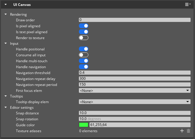
Rendering Properties
The following properties define how a canvas is rendered:
| Property | Description | Values | Default |
|---|---|---|---|
| Draw order | The value of this property determines the order that this canvas draws relative to other canvases. Higher numbers draw on top of lower numbers. When canvases have the same draw order, O3DE draws them in the order that they are loaded. | Int | 0 |
| Is pixel aligned | If enabled, makes textures look sharper by rounding the position of the elements’ corners to the nearest exact pixel. For example, if the position of a corner of an element rectangle is at (123.45, 678.90), then it is rounded to (123.00, 679.00). | Boolean | Enabled |
| Is text pixel aligned | If enabled, makes text look more crisp by rounding text positions down to the nearest pixel. An exception to this rule occurs when fonts are scaled down, in which case the text position is rounded to the nearest pixel. You might consider disabling this property if, for example, a text element will animate or move. | Boolean | Enabled |
| Render to texture | If enabled, the canvas is drawn to a material’s Base Color texture rather than to the screen. You must select an Attachment Image asset to use for the texture in the Render Target property. For more information, refer to Placing UI Canvases in the 3D World. | Boolean | Disabled |
| Render Target | Selects the Attachment Image asset to render this canvas to. To generate an Attachment Image asset, create a new source file with the .attimage extension. Refer to the .attimage source file example that follows.This property is available only if Render to texture is set to Enabled. | Attachment Image asset | None |
Attachment Image assets
This example represents the contents of an Attachment Image’s .attimage source file.
{
    "Type": "JsonSerialization",
    "Version": 1,
    "ClassName": "AttachmentImageAsset",
    "ClassData": {
        "m_imageDescriptor": {
            "BindFlags": [
                "ShaderRead",
                "ShaderWrite",
                "Color"
            ],
            "Size": {
                "Width": 1280,
                "Height": 720
            },
            "Format": 19
        },
        "Name": "$UiCanvasTexture",
        "IsUniqueName": true
    }
}
For more detail about the AttachmentImageAsset class, refer to the following references:
AttachmentImageAssetclass API referenceImageDescriptorstruct API referenceDXGI_Formatenum definitions
Input Properties
The following properties define how a canvas handles inputs:
| Property | Description | Values | Default |
|---|---|---|---|
| Handle positional | Causes an automatic response to positional input such as mouse movement, mouse button clicks, and touch screen input. Keyboard inputs also cause an automatic response when an interactive UI element is active (such as an elemental with a Text Input component on it). Common reasons to de-select this property are if the canvas doesn’t require input, or if you configure your game to handle all inputs and pass selected inputs to the UI system. | Boolean | True |
| Consume all input | If enabled, this canvas consumes all input events, regardless of whether the canvas handles a specific input event. For example, if you have canvas A covering canvas B, you probably don’t want canvas B handling any input while canvas A is obstructing it, so you would select this property on canvas A. Modal dialog boxes are another example of a canvas that should have this property selected. Note that any time a canvas is loaded, if it’s set to consume all input, then it steals the inputs from any other loaded canvas. This includes canvases that are set to consume all inputs themselves. | Boolean | False |
| Handle multi-touch | If enabled, this property enables elements on the canvas to handle multi-touch input. This is useful for handling input from touch-based screens, such as mobile devices. | Boolean | True |
| Handle navigation | If enabled, causes an automatic response to navigation input. For example, on a PC, pressing arrow keys moves focus from one interactive UI element to the next, and pressing Enter activates an interactive UI element. It’s recommended to de-select this property for canvases that are placed in the game world. | Boolean | True |
| Navigation threshold | The analog input value, from a thumbstick, for example, that must be exceeded before a navigation command is processed. Adjust this value based on the input sensitivity needs of your UI. | Float: 0.0 - 1.0 | 0.4 |
| Navigation repeat delay | The delay, in milliseconds, before a held navigation command begins repeating. Adjust this value based on the needs of your UI. | Int: 0 to infinity | 300 |
| Navigation repeat period | The delay, in milliseconds, after the initial repeat delay, before a held navigation command repeats again. Adjust this value based on the needs of your UI. For example, if you had a menu list where you hold a button to navigate to the next item in the list, the navigation property settings are used as follows:
| Int: 0 to infinity | 150 |
| First focus element | Displayed when Handle navigation is selected. First focus element specifies which element gains focus when a canvas is first loaded and a mouse is not detected. For more information about element navigation, see First Focus Element. | UI Element | None |
Tooltips Properties
The following property defines how a canvas displays tooltips:
| Property | Description | Values | Default |
|---|---|---|---|
| Tooltip display element | Controls which element the game displays when a user hovers over an interactive element. Select an element from the drop-down list. This list is composed of the elements on your current canvas that contain the TooltipDisplay component. For more information about the Tooltips components, see Tooltip Components. | UI Elements with a TooltipDisplay component. | None |
Editor Settings Properties
The following properties define UI Editor behavior:
| Property | Description | Values | Default |
|---|---|---|---|
| Snap distance | The distance between positions on the grid when Snap to grid is selected in the toolbar. | Float: 1.0 to infinity | 10.0 |
| Snap rotation | The number of degrees between each step of rotation when you use the rotation gizmo to rotate an element in the viewport. Snap to grid must be enabled in the toolbar. | Float: 1.0 to 359.0 | 10.0 |
| Guide color | The color of the guide lines on this canvas. For more information about using guides in UI Editor, see Rulers and Guides. | Eight bits per channel color: 0 - 255 | 61,255,64 |
| Texture atlases | The texture atlas that this canvas loads. Using a texture atlas can reduce the number of draw calls in certain situations, resulting in better performance for your UI. For more information about texture atlases, see Using Texture Atlases. | Array of .texatlas | None |