IN THIS ARTICLE
UI Layout Cell Component
When working with cell contents, it’s important to understand the difference between a layout cell and the LayoutCell component. A layout cell represents a set of values that determine the space or area allocated to a child in a layout row or column. The LayoutCell component, on the other hand, manipulates the way a layout cell is sized. A layout cell exists on a child of a layout row or layout column whether or not it has a LayoutCell component. The LayoutCell component simply provides a way to manipulate and override the default calculations of a layout cell.
A layout cell’s properties consist of a minimum size, a target size, and an extra size ratio. These properties are not directly modifiable in the UI Editor, but are determined in several ways:
Components - The following components can affect the layout cell size:
Image or text - The image’s default size is the layout cell’s target size. The length and size of a string in a text component is the layout cell’s target size.
Layout row or layout column (added or nested as children) - The default values of a layout row or layout column, added as a child, determines the layout cell’s minimum and target size. The default value is calculated by the sum of its own children plus padding and spacing.
Note:The LayoutColumn and LayoutRow components contain a property called Ignore Default Cells. Selecting this property causes the above calculations to be ignored and simply allocate equal space to all children regardless of content. Clear this property to calculate layout cell values by components. For more information, see LayoutColumn.
Fixed default layout cell values - If the child doesn’t have any components that calculate their own layout cell values, then the layout cell is assigned a minimum and target size of 0 and an extra size ratio of 1. This typically means equal spacing for the children that do not have a component affecting the layout cell’s size. Each layout cell grows at the same rate to fill the available space (hence the extra size ratio of 1).
LayoutCell component - Add the LayoutCell component to specify values for the minimum and target sizes, and the extra size ratio. Any values you specify here override the values calculated by all other methods.
After layout cell values are calculated, layout cell space is allocated by the following:
First, each child receives its minimum size (Min Height or Min Width).
If space is available, each child receives its target size (Target Height or Target Width).
If space is still available after that, then the Extra Size Ratio value is used to determine how to allocate the remaining space. This ratio is relative to the child’s siblings. For example, if one child’s extra size ratio is 1, and another child’s is 2, then the second child gains twice as much extra space as the first child. An extra size ratio of 0 means that no more space is allocated once the target size is reached.
Using the LayoutCell Component
You can apply the LayoutCell component to the children of a layout row or column to override the layout cell’s default calculations.
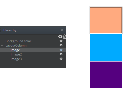
In the following example, the layout column has three images as its children. The images each occupy equal space in the column.

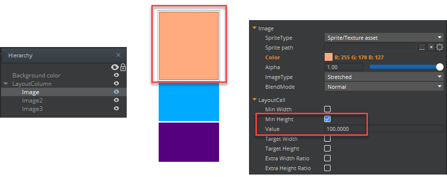
If you add a LayoutCell component to the first image, and then select Min Height and assign a value of 100, then the UI system overrides that child’s default calculated value, and gives the top image more height than its siblings, whose values are recalculated to adjust to the remaining column space.

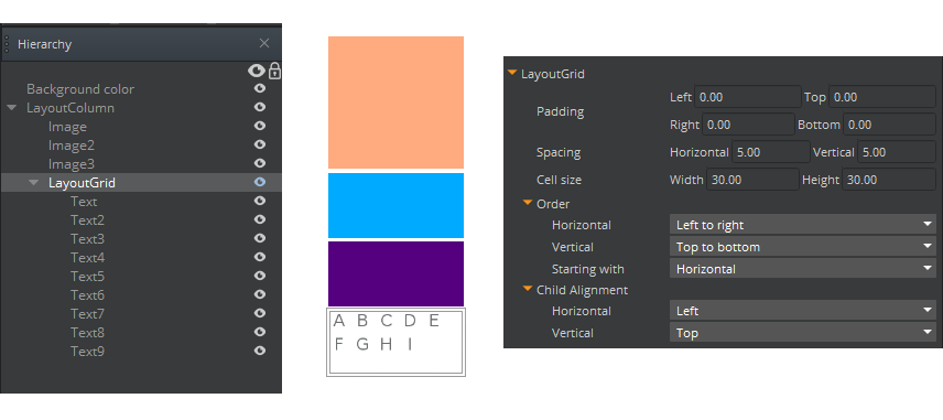
In the next example, a layout grid was added as a child. Its calculated size is the same as its two siblings above it.

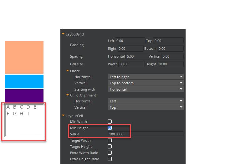
However, when you add a LayoutCell component to the grid, and then specify a Min Height of 100, then the grid, as a whole is granted that amount of space. If you add the LayoutCell component to the children of a layout grid, however, it has no effect. That’s because individual grid spaces are always uniform and are controlled by the grid parent.

To edit a LayoutCell component
In the Properties pane of the UI Editor, expand LayoutCell and do the following, as appropriate:
Min Width
Select to define the layout cell’s minimum width. Type a value in the box that appears.
Min Height
Select to define the layout cell’s minimum height. Type a value in the box that appears.
Target Width
Select to define the layout cell’s target width. Type a value in the box that appears. If space is available, this target width is allocated to the layout cell.
Target Height
Select to define the target height. Type a value in the box that appears. If space is available, this target height is allocated to the layout cell.
Extra Width Ratio
Select to define the layout cell’s extra width ratio. Type a value in the box that appears. This value is a ratio that is relative to the other elements. If space remains after the layout cell reaches its target size, the Extra Size Ratio value is used to allocate the rest of the space.
Because this Extra Size Ratio value is relative to the other children, if one child’s extra size ratio is 1, and another child’s is 2, then the second child gains twice as much extra space as the first child. An extra size ratio of 0 means that no more space is allocated once the target size is reached.
Extra Height Ratio Select to define the layout cell’s extra height ratio. Type a value in the box that appears.
