UI Layout Grid Component
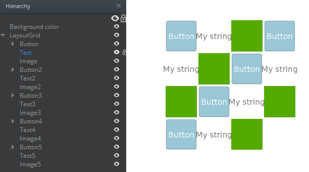
You can use a layout grid component to organize child elements into a uniform grid. To use this feature, you add the layout grid component to an element and then add child elements. The UI system positions the child elements in a grid pattern. You can choose whether the child elements are positioned left to right or right to left, and bottom to top or top to bottom. The child elements can contain a texture or image, a piece of text, a button, a check box, more columns, rows, grids, and so on. The size of each child is determined by the Cell Size property and is independent of each child’s content.

To see an in-game example of a completed canvas with the LayoutGrid component, open the level UiFeatures in the project SamplesProject. Press Ctrl+G to play the game, and then choose Components, Layout Components, Layout Grid. You can view examples of different fill patterns. Press Esc to exit the game.
To view this same canvas in the UI Editor, navigate to the \Gems\LyShineExamples\Assets\UI\Canvases\LyShineExamples\Comp\Layout directory and open the SimpleGrid.uicanvas file.
You can add a prebuilt Layout Grid element from the slice library. When you do this, a simple layout grid is automatically created and nested in your Hierarchy pane.
To add a Layout Grid element from the slice library
- In the UI Editor, choose New, Element from Slice Library, LayoutGrid.
To edit a layout grid component
In the Properties pane of the UI Editor, expand LayoutGrid and do the following, as appropriate:
Padding
Type values in pixels, relative to the element’s borders.
Spacing
Type values in pixels to adjust spacing among elements.
Cell size
Type values in pixels to specify the size of the child elements.
Order
Do the following as appropriate:
- For Horizontal, select Left-to-Right or Right-to-Left to determine the order in which elements appear horizontally.
- For Vertical, select Top-to-Bottom or Bottom-to-Top to determine the order in which elements appear vertically.
- For Starting With, select Horizontal or Vertical to determine whether elements appear horizontally or vertically first.
Child Alignment If the layout’s children don’t occupy all the available layout space, this setting determines how the children are aligned.
For Horizontal, select Left, Center, or Right to determine how the children are aligned horizontally.
For Vertical, select Top, Center, or Bottom to determine how the children are aligned vertically.
